Is Batting Average a useful measure in Test cricket?
A look at batting performance, floor vs ceiling outcomes and how we can use metrics to compare player performance and styles.
This month sees the return of the IPL, with it’s bright lights, massive crowds and audience of millions, but also the more docile ebbs and flows of the County Championship and the start of the English summer of cricket. So, with a bit of time on my hands, I’ve decided to write a bit about longer form cricket, and analysing batting in particular.
In the three weeks since the end of the India Test series, there have been a few stories that got me thinking about how we discuss batting in Test cricket, and whether the statistical tools we have accurately capture the nuance of the sport. Yes, this piece is more stats than science, but the two often interlink when trying to convey a message to the cricket-watching audience. Also, just to prepare you, this quite a long read, so make sure you’re sat comfortably.
The first media story that sparked the idea for this post was a brief resurgence of the combined Average + Strike Rate measure for T20 cricket. This is an example of truly meaningless number that sometimes gets bandied around when discussing cricket, and shows you how not to create an ‘advanced metric’ (adding two numbers together arbitrarily).
For context, there are some very good metrics for measuring the important of scoring lots vs scoring quickly in short form cricket, including those which take into account the match situation, but that is not my expertise, or the purpose of this piece.
The second was an article in Wisden which discussed Ollie Pope’s batting in India. The piece is well written, and includes some interesting data and figures, but I felt the discussion was lacking some nuance. The main issue being that the majority of numbers quoted were simply batting averages with different filters - 22 versus India and Australia, 50+ against everyone else etc.
Instead, I’d like to propose some alternative metrics and lenses through which to view red ball batting. But first, lets have a quick look at how batting average, the only commonly used stat is used to describe player performance.
Batting Average vs Root Maths
Batting average is quite a blunt statistical instrument. Logically, the team who scores the most runs per wicket, should win a Test, all things else remaining equal, so the ‘average’ score of each team gives you an idea who is more likely to win.
However, it is also used to tell you what we should expect of a specific batter when they come to the crease, their ‘most likely’ outcome, as it were. In some examples, a simple mean (a total divided my a number of instances) is a good measure of that, but not with batting. No one actually scores their average very often!
Without going too technical, the key point is to consider the underlying distribution of the numbers you are averaging. If they form a classic Bell Curve (also known as a Normal Distribution), such as the height of the population of the UK, then the average height is also the most likely. Certain aspects of cricket are normally distributed, such as bowling speeds, but batting scores are not one of them.
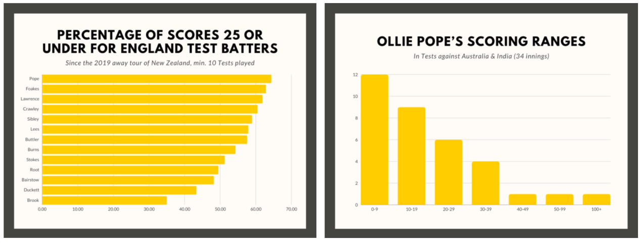
The graphs from the Wisden article I mentioned earlier actually highlight this point well. The first one shows that nearly 65% of Pope’s scores since 2019 are under 25 runs, yet in that time he averages 32 runs per wicket. So clearly, his average score is not the most likely at all! So what is it telling us about what he will do in the future?
The second graphs shows what the underlying distribution of scores actually looks like (even if the binning of scores on the x-axis is horrible). Lots of low scores, and a few big hundreds.
Dave Tickner uses the phrase ‘Root Maths’ to describe when a statistical sample is selected in order to outline a particular point, especially when it involves quoting a player’s average after removing some high scores. The quotation below is taken from one of his articles.
The key takeaway is that all batters have a large proportion of low scores, and then several large scores which bring their average up. This is why Root Maths is so effective at making someone look bad. Take out one or two big scores, and their average plummets. What a surprise.
So, if batting average doesn’t really tell us what someone is likely to do in the future, and we don’t want to spend all day looking at score distributions, what should we do with the numbers? In general, I like to think about a batter’s Range of Outcomes. Basically, what types of innings are possible for a given batter, and how likely are they to achieve them.
Floor vs Ceiling outcomes
When assessing a player’s range of outcomes, it is important to think about how you win Test matches with the bat. Obviously the answer ‘score more runs’, but I’m thinking about how those runs are scored by each player. And with that question, it’s time to look at some data from the last couple of years of English cricket.
England have played 23 Tests in the Bazball era, since June 2022, winning 14, losing 8 and drawing 1. I’ve analysed some key stats from those games in terms of the range of individual scores which contribute to a win. I’ll leave out the draw with Australia due to the rain affected nature of the game, and because draws are officially boring cricket in this era.
But first, let’s define a batter’s Floor, meaning the lowest level of expected production in Test cricket. I have slightly arbitrarily chosen a score of more than 20 runs to be a successful floor performance. Anything less than 20 would likely be considered a failure, so that seems at least somewhat logical.
Now for a Ceiling outcome, meaning a high-end, possibly game winning performance, I have taken a batter scoring one of the 4 highest scores in a Test match. I’ve chosen this range as there are 4 innings to a game, and so a top-4 score will likely be match defining in some way.
Here’s how the outcomes of England’s last 22 Tests with a result were impacted by floor and ceiling batting performances. First, let’s look at the number of ‘top-4’ or ceiling outcomes for the 22 winning teams:
1 match had 4/4 ceiling outcomes for the winning team (total dominance)
8 matches had 3/4 ceiling outcomes for the winning team (better than opposition)
10 matches had 2/4 ceiling outcomes for the winning team (even split)
3 matches had 1/4 ceiling outcomes for the winning team (worse but still won)
Unsurprisingly, no team won a match without a top-4 score in the game. What these numbers tell you is that, for this sample, only a small number (3 out of 22 = 13.6%) of wins came without at least two batters hitting their ceiling. In fact, in those 3 games where only one batter hit a ceiling score and the team won, that score was at least 150.
In contrast, for games where one team has at least 3 of the top scores, that side win three quarters of the time (9 out of 12 = 75%). Again, this might not come as a big surprise, but it does show you the power of a ceiling outcome. If you have 3 batters who score big across 2 innings, the chances are that you win, irrespective of how the rest of the batting line up performs.
But what about hitting the impact of failing to reach a floor outcome? Well, in the same sample size, for the top 7 batters on the losing team:
In 15 matches, they scored less than 20 more often than the winner (many failures)
In 7 matches, they scored less than 20 less often than the winner (lots of starts)
So, when a team has a top 7 that fails to reach it’s floor outcome more often than the opposition (i.e. has lots of failures), they lose 68% (15 out of 22) times.
Interestingly, in the games where both teams had 2/4 ceiling scores, there was only a 50% win rate for the team hit more floor scores (scored > 20 more often). This indicates that in games where no team dominated the ceiling outcomes, having a higher floor didn’t result in winning more games.
One thing to point with these ceiling and floor metrics is that they aren’t independent. A team which has more batters scoring more than 20 will have an increased chance for one of them to go on and register a big score. For a team, good batting has both a high floor and a high ceiling. When teams win a game, it was likely a combination of both.
However, what I am interested in doing is looking at individual batters. Hitting a floor is good, but it is the big ceiling scores where individuals win a game.
I’m going to break down the individual innings from this sample, and assess players' floor and ceiling scores. Are there batters who often get out for less than 20, but contribute ceiling outcomes when they don’t? Are there players who often get to 20, but don’t kick on? And how do these numbers relate to a player’s average?
Analysing batters by their Range of Outcomes
Okay, time for some graphs, what is a stats article without lots of graphs. I know that’s why you’re all here really.
The first one will look at the floor and ceiling outcomes of the most common England top and middle order since 2022. To clarify, the Floor Percentage is how often a player gets to 20 in innings where they are dismissed. Ceiling Percentage is how often they produce a top-4 score in a Test, once they pass 20. The idea here is to differentiate between bad starters and those who contribute once they are ‘in’.
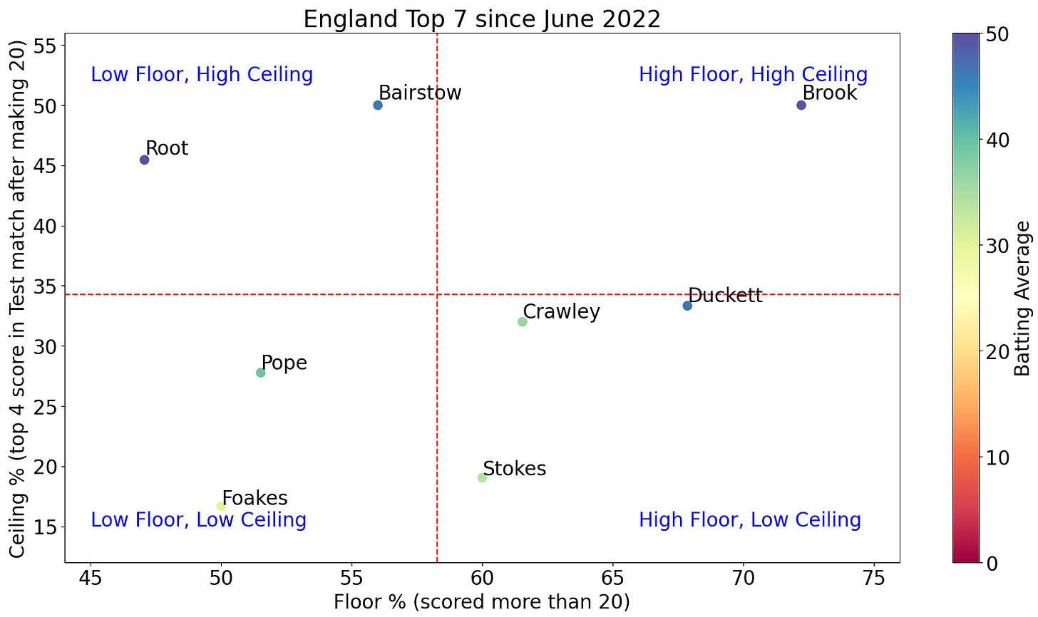
There are a few things to point out on this plot. Firstly, the red lines are the mean values from the batters shown, and the colour of each marker is denoted by the player’s batting average. Points to the left of the plot indicate batters who are often dismissed for less than 20, and points near the top indicate players who often contribute a top-4 score once they pass 20.

So, let’s compare some players with a similar batting average. After all, the aim of this is to see what average actually tells us. Looking at the table above, I’m going to group them into tiers. Root and Brook, who I’ve discussed, sit atop the pile, both averaging over 50. Next we have Duckett and Bairstow together averaging ~45, then Pope and Crawley with 35-40, and finally Stokes and Foakes under 35.
Elite Tier
The scatter graph shows how the two guys in this tier score their runs. Firstly, Harry Brook is really good, and I can’t wait to watch him play more. He gets to 20 regularly, over 70% of the time, and then turns those scores into meaningful contributions at nearly 50%. A really, really exciting player, even if the sample size is currently quite small.
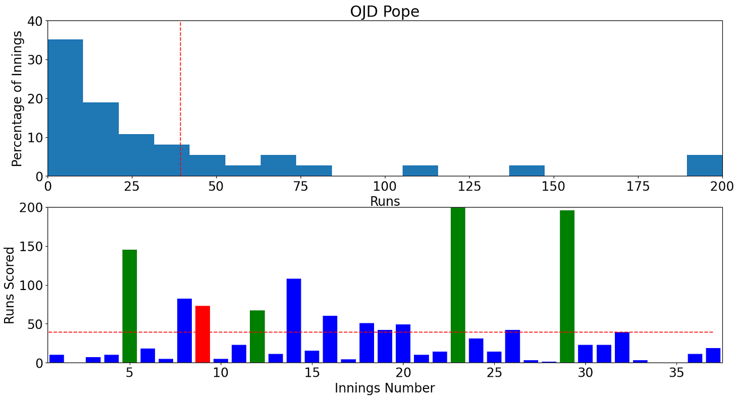
Next, Joe Root is also really good, but interestingly has the lowest Floor Percentage of any batter, showing he has been a poor starter. This has possibly contributed to some of the criticism of him recently (which I feel has been unwarranted), as people expect him to have a consistent floor. However, his Ceiling Percentage is excellent, showing how his range of outcomes still includes huge scores. Just look at his distribution below.
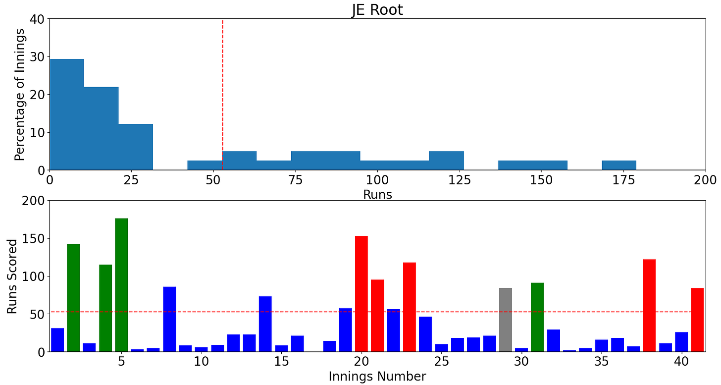
Maybe this is the Bazball version of Root? A poor starter, but a true gamechanger nonetheless. Maybe I’ll have a look at his performance pre-2022 for comparison in the future, as he’s often been seen more as ‘Mr Dependable’.
Either way, the player’s averages here don’t really lie, they’ve both been excellent, but Root’s floor and ceiling numbers certainly provide extra information which you don’t get from a single number.
Trade-off Tier
The Bairstow and Duckett comparison is one where the floor and ceiling graph is really useful. You can clearly see the contrast between Bairstow, a lower floor but incredibly high ceiling batter, vs Duckett, who has a very solid floor, but kicks on maybe less than you would like. This is why average is too simplistic, it doesn’t capture the stylistic differences between the two players.
I know batting position and match situation will play a role in batting style, but the contrast between Bairstow and Duckett shows the importance of pairing archetypes of player together. If you whole team was floor players, you’d miss out of the games that Bairstow has won for England. If they were all ceiling players, you run the risk of losing a Test in one innings where no one gets a start. I call this the ‘Trade-off’ tier - they are high floor or ceiling, not both.
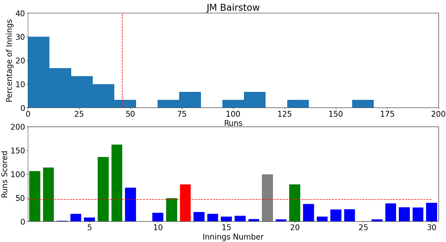
Interestingly, Bairstow has both a higher Floor and Ceiling Percentage than Root, despite averaging less. This is due to more middling scores for Root, where he scores 50+ but doesn’t hit a ceiling score, which don’t show up in these metric, but boost his average.
Nearly There Tier
Now we come to the next 2 batters by average - Pope and Crawley. While Pope averages more (39 vs 36), you can see both his Floor and Ceiling Percentages are worse than Crawley.
This is where Root Maths comes into play; Pope’s average is massively pushed up by two huge scores near 200, one vs Ireland and one vs India. However, his underlying distribution is littered with low poor starts and unfulfilled starts.
Crawley, however, has a similar Ceiling Percentage to Duckett, but a string of low scores, and only two hundreds, pulls his average down. Again, this is where Duckett’s middling scores boost his average, but not his Ceiling Percentage.
These players are in the ‘Nearly There’ tier for me. To get to the next level, Pope and Crawley need to boost either their ceiling or floor. Pope, especially, has discussed his poor starting, but if he can make the leap to boosting his ceiling, then it stops being a problem. Look at where Root is on the first scatter graph, his poor starts don’t affect his output because the ceiling is there.
Crawley is an interesting one. He was seen as Boom-Bust, high variance player when he came into the team, but his floor has certainly improved in the last year.
Below is the same scatter since January 2023. Crawley is scoring over 20 in 70+% of innings, and has flipped places with Duckett. This shows his increased floor, but I’d love him to raise his ceiling, and take his place as one of the truly great England openers, like Strauss, Trescothick and Cook, who could completely dominate a game once they were set.
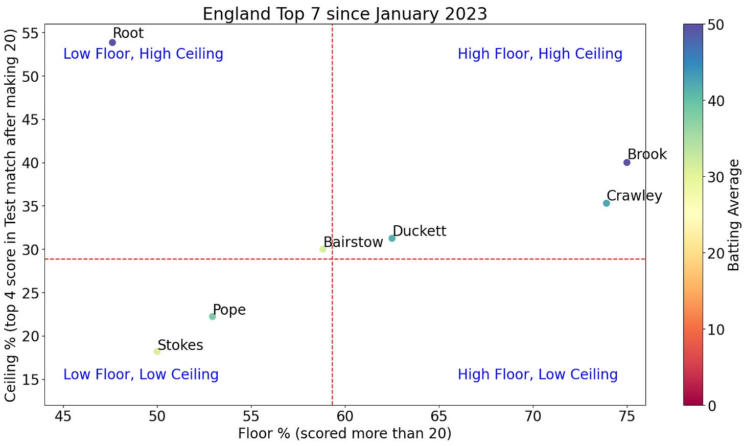
A quick aside on this plot - Root and Brook still elite, but Bairstow has fallen a lot since his incredible 2022 summer. I hope he can rectify his position with some more big scores in 2024, but that is the risk with high variance players.
Batting with the Tail Tier
I'm starting this tier by outlining a couple of the flaws with the measures I’m using here, namely that it doesn’t account for batting position. Unsurprisingly, the ceiling likelihood of numbers 6 and 7 in the batting order will be limited by a lack of partners, so it maybe isn’t fair to compare them with the top 5.
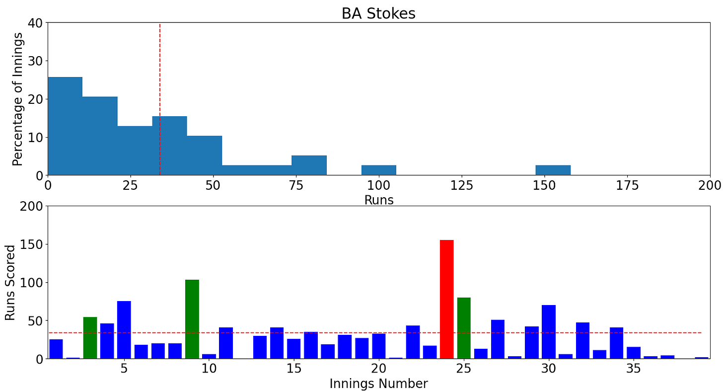
However, the position of Stokes and Foakes in the scatter plots is slightly concerning to me. Stokes, at least, has a solid Floor Percentage near 60%, but his ceiling value is less than 20% once he gets there. Again, running out of time or partners may be a cause, but for one of the world’s best batting talents, that feels low.
Foakes is a tough evaluation, as 10/24 innings were in the recent India away series, the toughest challenge in Test cricket. He averages 30, which feels low if he is to keep Bairstow out of the side when Brook returns.
Foakes has only reached 20 in half of his innings, which doesn’t scream lower order solidity, something that his admirers have often praised him for. His chances to hit a ceiling will always be limited at 7, simply because he doesn’t have the power game to make a huge score when the field is spread.
I think his talents are more suited at number 5, where he has more time to build an innings, like he does for Surrey. The shift could allow Bairstow and Stokes the freedom to attack with the tail from 6 and 7, both of whom have a higher chance at a ceiling outcome in those circumstance.
Otherwise, if he is to secure the role of keeper-batter in this side, I feel he needs to either be a reliable floor player (70+%) and let others bat around him (like we’ve seen with him and Root at times), or start showing some ceiling. None of this stops him being an incredible wicket keeper/cricket’s most handsome man, however.
Batting average is a reliable statistic, but lacks context
So, what has all of this discussion of floor and ceiling actually told us? Well, hopefully you can see that batting average is lacking in the context required to build a Test match line-up. The Root Maths method of throwing away scores is also not helpful, as we always want the largest sample size, as that tells us the most information about a player.
A simple average may allow us to sort batters into tiers, but I’m not sure it helps differentiate types of players, or accurately describes someone’s potential. If you’re average is over 50, then you are a great player. If it is less than that, there is a lot of information being thrown away by simplifying a record to one number.
Instead, let’s understand that consistency in batting is often fool’s gold, and no one who average 40 does it by regularly scoring 30-50 runs. Getting a start is much less important than making that start count, Joe Root being a perfect example.
We can praise players like Crawley for raising his floor, and giving himself opportunities, but also understand that raising his ceiling takes him to the next level. Let’s have patience with batters like Bairstow and Stokes, because we’ve seen how they can win games with ceiling outcomes, despite struggling to get going at times.
Context is key, and nuance is sometime hard to find in this era of media polarisation. Bazball is neither the saviour of cricket, nor the death of it. We live in a world of statistical ranges, so let’s stop trying to define everything by one number, or put it into one category.
Thanks for reading this rather long post, I hope it has at least made you think when you’re next watching some cricket. I, for one, am exciting for the continuation of the IPL, the start of the County Championship and playing some cricket outdoors myself. And for all the batters about to start their season, may your floors be high, but your ceilings higher! Go well!


